EU and US buyers often ask for similar nightstand shapes but different color behavior. Some channels prefer clean light oak or white, while others accept warmer walnut, black, or mixed-material accents.
Color planning should use market position, photography needs, seasonality, and reorder stability rather than a single trend image. When the buyer still needs to decide how color becomes a manufacturable surface, pair this article with the finish selection guide and test the preferred tones against the modern nightstands that will carry the first order.
Color depends on channel, not only region
EU and US buyers may both request modern colors, but the sales channel changes the best choice. Ecommerce needs photo-friendly colors; retail stores need coordinated room displays; project buyers need calm tones that can be replaced later.
A color that performs well online may not be ideal for a hotel project, and a project-safe color may look too plain for a seasonal retail launch.
Build a stable base palette
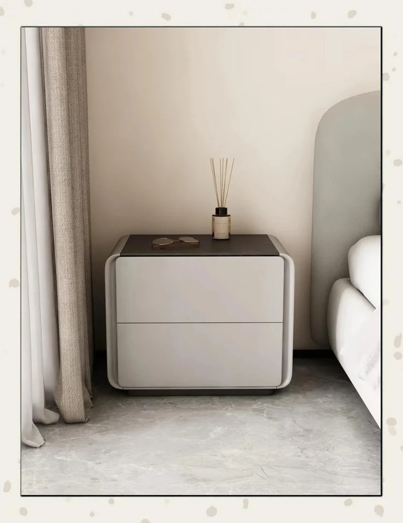
For repeat orders, stable base colors are safer than one-off trend colors. Light oak, walnut, white, grey, and black can be used as base directions, then adjusted with handles or surface details.
Buyers can test accent colors later after the core range proves sales demand.
Review color with hardware and room context
The same grey can feel cold with silver handles and warmer with brass accents. Wood-look finishes also change depending on lighting and wall color.
Review color samples next to the intended handle, top material, and room reference. This avoids approving a color in isolation.
Plan colors by reorder risk
Some colors are good for a campaign but risky for repeat orders. A stable base palette lets the buyer reorder with less color drift, while seasonal colors can be tested in smaller quantities.
If the buyer sells in both EU and US channels, keep one shared base color and adjust details such as handles, top material, or photography style for each market.
Plan Base Colors and Accent Colors Separately
Base colors should be stable enough for repeat orders. Accent colors can be tested in smaller quantities or seasonal programs. Mixing these two roles creates inventory and reorder risk.
For EU and US channels, light wood, warm walnut, white, grey, and black can all work, but the buyer should decide which one is the long-term base.
Review Color With Photography in Mind
Ecommerce colors must look consistent in product photos and room scenes. A finish that shifts strongly under different lighting can create returns or customer disappointment.
Ask for sample photos under warm light, cool light, and natural light before approving a color for online sale.
How to brief a color request
Send the market, channel, room image, preferred palette, and expected reorder plan. The supplier can recommend colors that balance sales appeal and production consistency.
Color planning should include photography
Some finishes look warm and premium in a showroom but appear too dark in ecommerce thumbnails. Others look clean online but may feel plain in a retail room display. Buyers should test photos before finalizing color range.
For US channels, warm neutrals and practical wood tones often work well across many room styles. For EU channels, softer modern neutrals and compact designs may be easier to place in smaller bedrooms. These are tendencies, not fixed rules.
Do not over-expand the first color range
Launching too many colors can make production, photography, stock control, and reorder planning harder. For a first order, buyers often get better control from one main color and one secondary color that serves a clear channel need.
After sales data is available, the buyer can expand into darker, lighter, or seasonal finishes. This approach lets color planning follow market evidence instead of relying only on trend forecasts.
Use sales data to refresh color decisions
Color planning should not stop after the first purchase order. Review sales speed, return comments, customer photos, and distributor feedback before repeating the same finish range. A color that looks fashionable may still sell slowly if it is hard to match with common bedroom furniture.
When the buyer refreshes colors, keep at least one stable finish for continuity. A familiar core color helps repeat customers and distributors compare new models with previous stock.